Part of Sherwin-Williams, Valspar is a paint manufacturer that specialises in colour and giving homeowners the freedom to express their unique taste.
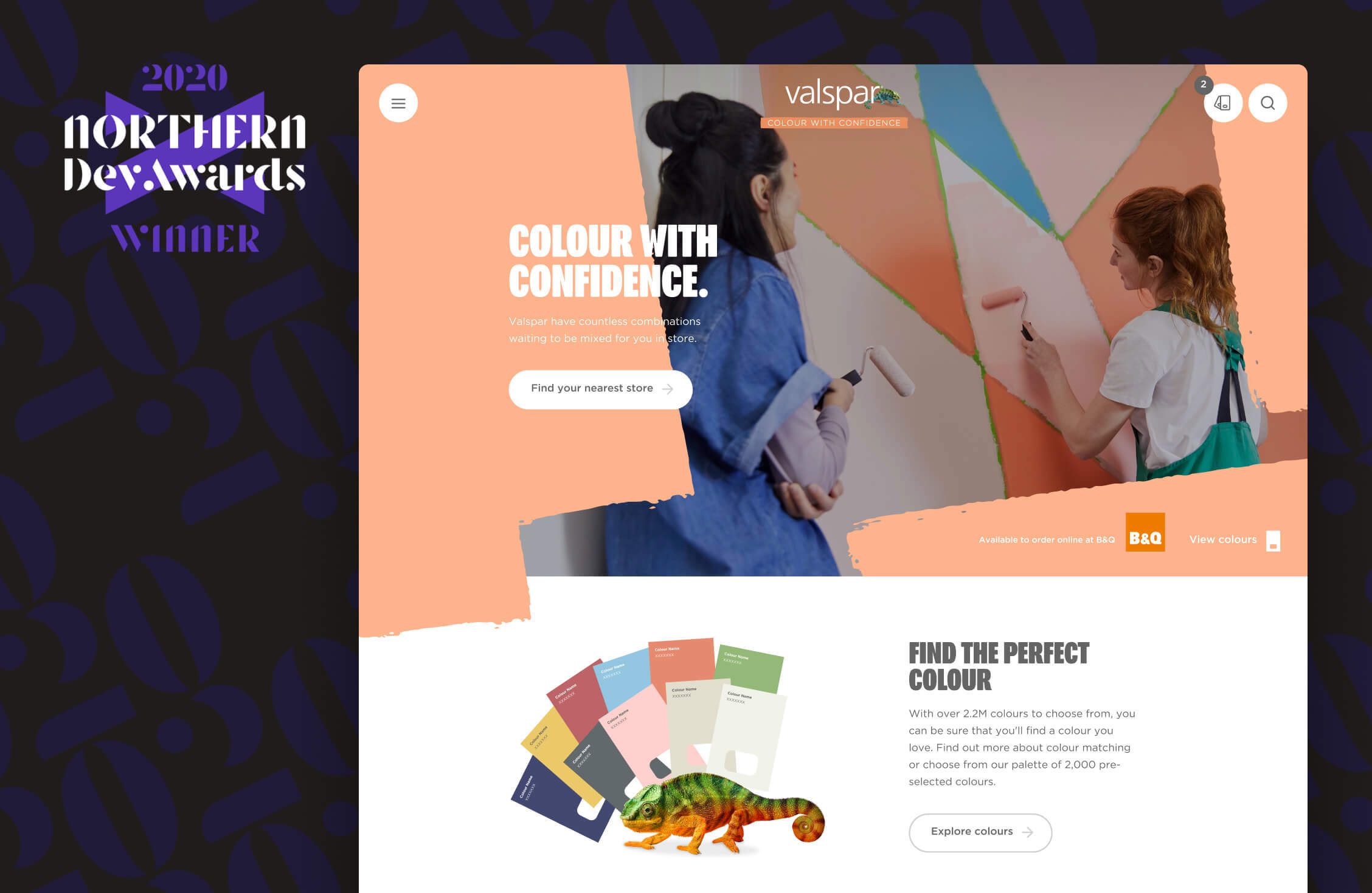
Valspar's innovative colour matching technology can match any one of the 2.2 million colours that the eye can see. For consumers who prefer to browse for colours, Valspar has 2,000 handpicked shades to choose from.
Valspar has been a leading brand in the US for over 200 years but first launched in the UK market in 2015. Its high-quality products and obsession with colour make it a fierce competitor against other household paint names.
The challenge
Valspar's previous website helped to establish the brand, providing a foundation for consumers to find out more about the paint and colours available. But to help Valspar reach its business objectives, it needed a website with the capability to grow and innovate.
The limited scale of the website meant Valspar was primarily reaching consumers at the decision-making phase of the customer journey. However it was missing out on audiences looking for inspiration as well as post-purchase advice.
It was also unclear how effective the website was. With no tracking or goals it was uncertain which areas users engaged with as well as where to attribute its marketing activity.
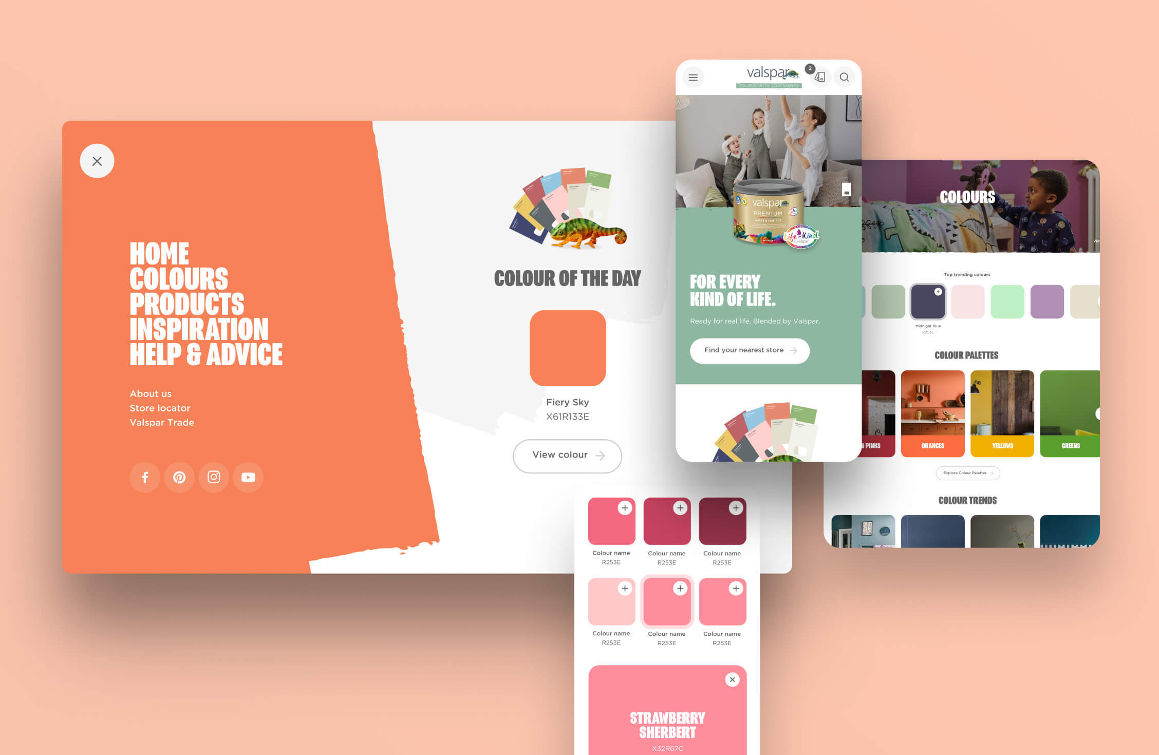
All this pointed towards a new website. Valspar needed a site which put colour at the forefront of its messaging, had the functionality to help users make informed decisions and showcased the spectrum of choice across colour chips and paint products.
As an added challenge, the first requirement of the website was to support a new TV campaign that marked the start of Valspar's busiest time of year. That gave us four months to design, build and implement a new website that showcased Valspar's brand, products, and USP.
The solution
There were two key strands of our work for Valspar. The initial site launch included detailed product pages, colour collections, a paint coverage calculator and a store finder function. And secondly, ongoing activity to showcase Valspar's colour expertise, its colour matching technology, and to position it as the go-to brand for inspiration and decorating tips.
The website launched alongside the TV campaign, featuring core information and tools to help users progress along the customer journey. The initial launch promoted Valspar's USP, setting it apart from its competitors as the brand for expressing unique interiors taste.
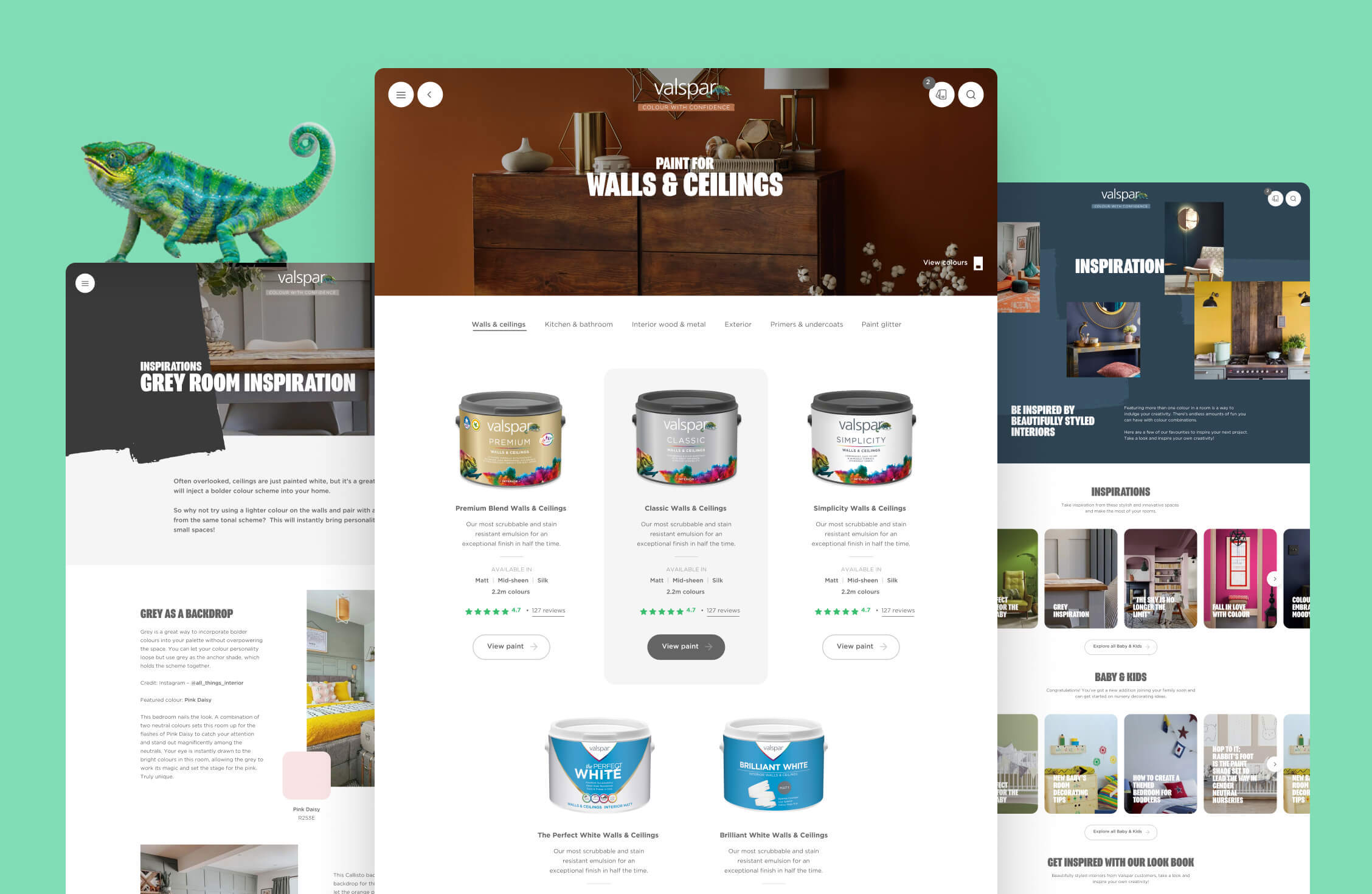
After the initial launch, we focused on attracting consumers earlier in the customer journey. We built a content and inspiration hub that promoted Valspar's colour expertise. The website showcases the huge range of colours available in 12 key categories. Each category has a stunning gradient of colour chips which mirror the in-store layout of the colour rack. This ensures customers have a consistent experience and can seamlessly transition from online browsing to offline purchasing.
Quick and convenient tools
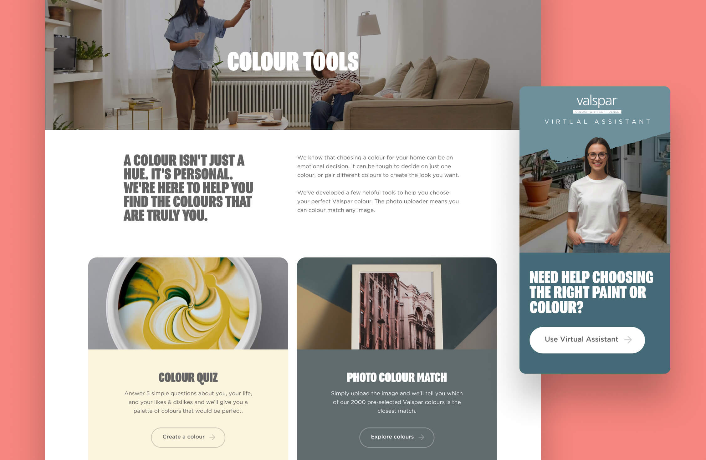
With 2,000 ready-mixed colours, Valspar's range is a luxurious spectrum. To help customers make an easy and informed decision, we created a range of tools, including a photo uploader that identifies colours in a photo and matches them to Valspar’s nearest Valspar colour.
Through continually examining the customer journey, we found that Pinterest is a massive source of inspiration. So to connect the dots, we designed an analyser tool which matches the colours in Pins with Valspar's nearest paint colour.
Colour guides
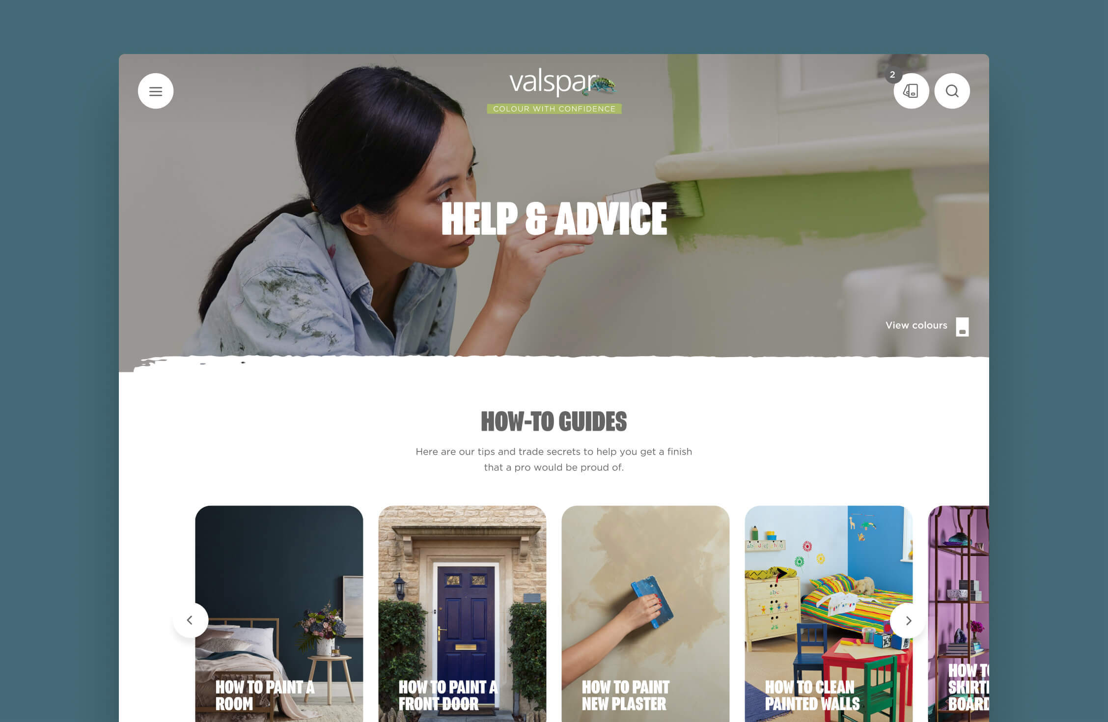
As a final touchpoint to the customer journey, we created a series of guides around key decorating queries. This served two purposes; it increased the visibility of Valspar in search engines, and it gave users useful advice around decorating, helping them get the most out of Valspar's paint.
