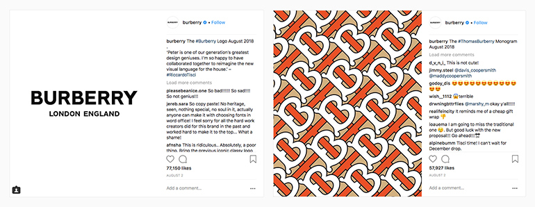
Earlier this month Burberry revealed a new logo and monogram for the first time in 20 years.
Chief Creative Officer Riccardo Tisci commissioned Peter Saville, well known for his work on record sleeves as well as recently working with other fashion houses, back in March to undertake the project in a mere four weeks (make of that what you will).
The old inspires the new
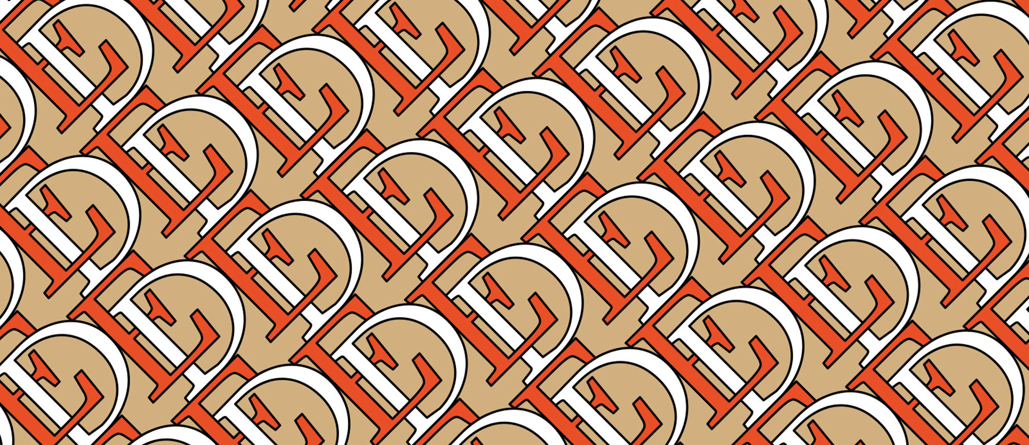
The new look is said to be inspired by Burberry’s heritage in the form of a monogram Tisci found in archives from 1908. It’s made up of a contemporary pattern of capital T’s and B’s (a subtle nod to the check and Thomas Burberry) set in a bold palette of orange, brown and white. The palette is a departure from Burberry’s traditional checked pattern and is more reminiscent of Gucci’s avant-garde approach to fashion. An indication, perhaps, of where the fashion brand could be going for its next collection.

However the logo has had a dramatic overhaul. Saville has dropped the recognisable (or iconic?) serif typeface in favour of a bold, all-caps, sans serif face. ‘England’ has also been added alongside ‘London’ underneath the name, just in case you thought it was actually based in London, Ontario. A move that’s caused the most contention though, is the complete removal of the knight, an image synonymous with the Burberry brand since 1909.
Less is more
This rebrand follows a trend set by brands – Google, Spotify and Airbnb to name a few – moving towards undecorated and simpler logo styles. Bold and neutral logos, especially for tech companies, communicates to customers that the services they provide are simple, clear and straight to the point. As their services are provided through online apps, it makes sense to remove the chaos of a complicated logo and have something that sits as part of the apps’ user interface (UI), ultimately letting their services do the talking.

The same goes for Burberry. In the digital age elements of the old logo, like the knight, can become unrecognisable at smaller sizes on screens, much like certain serif fonts become unreadable below a certain font size. Although the change in style means Burberry is dropping the traditional heritage touches from its logo, much to the disgust of fans and designers alike on social media, the new logo now feels part of the website’s UI but it’s also still strong and bold enough to be recognisable in isolation. A toned-down logo means that Burberry’s personality and style can shine through its clothing instead.
With that in mind, I suspect that Tisci is attempting to help Burberry translate into the digital age – a point that’s reinforced by the fact the new logo and monogram were revealed on Instagram.
Applying it to the rest of the site
If we look at how Burberry has integrated the new elements into its online experience, it might look like a straightforward swap of the old and new logos but there's a little more to it. The new sans serif logo slips seamlessly into where the old serif logo sat in the navigation bar. It sits alongside the menu items and icons in the top right, which have been tweaked to match the style of the new logo.

The font used for the menu items has changed from Apercu Medium to Styrene B Medium, which looks like it has been modified, or tailored, for Burberry. The icons to the far right of the navigation are now slightly bolder, which matches the new font weight of the logo. Like I mentioned above, these changes allow the logo to stand alone and complement the UI, letting Burberry’s products come to the fore.
Teasing the future
The monogram has been implemented as a fixed position background between the main hero and collections which flashes past as you scroll. It’s expected that the monogram will be used in Tisci’s debut collection and so this blink-and-you’ll-miss-it approach could be teasing things to come in mid-September.
Since the update, imagery on the website has also changed. When you land on the page the main hero image is now void of colour before you’re hit with the bold colours of the monogram. This helps the monogram really jump out of the page and grab your attention. It’s again emphasising that change is coming.
One other minor detail to notice is, at the time of writing, the favicon still remains as the serif B from the old logo. Whether this is deliberate as a way of transitioning to the new brand or a small oversight remains unknown.
I think it’s safe to say that there's definitely more to come from Burberry over the coming months. Both in terms of how it’s new look translates to its clothing and how it’s treated online. One thing is certain though, there’s a lot of potential for interesting experiences and as Burberry is a high fashion brand, it’ll definitely be surprising.


