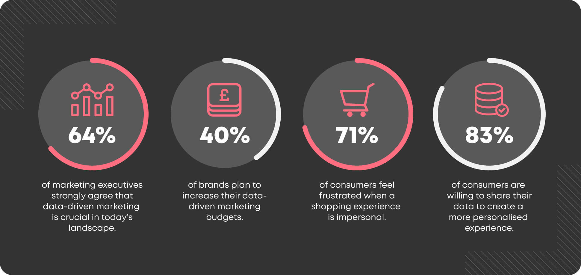
The days of mass, untargeted broadcasting are numbered.
To succeed in today’s changing world, you need to know your customers inside out and leverage this insight to create marketing communications that through the chatter and capture the imagination.
What is data-driven marketing?
Put simply, data-driven marketing is the process of optimising marketing comms based on information and insight, to provide the maximum possible return on investment (ROI).
Why is data-driven marketing becoming the new norm?
Let’s face it, data-driven decisions beat gut instinct, which is why data-driven marketing is quickly becoming the new norm. Here’s just a few benefits of a data-driven approach:
- Understanding your audience
Every business exists to solve a problem, right? Using analytics and social listening tools can help you gain a laser-sharp understanding of your audience, their motivations, sentiments, needs and behaviours, which you can use to shape future products, services and communications. - Choosing the right channels
Social media, online advertising, influencer marketing, email, blog content - there’s an ever-growing number of marketing channels at your disposal, but you can’t rely on instinct to select which ones are best suited for a campaign. Use data to learn which channels are most suited to your audience. For instance, if you’re targeting the gen-z demographic, Instagram is a strong option, with 30% of users being 18-24. - Personalising your communications
Marketing data can be leveraged to create personalised marketing campaigns that help you reach the right customer with the right message at the right time. Take Spotify’s “Discover weekly” for example, which uses an algorithm to build a custom playlist for listeners based on their listening habits. This deep degree of personalisation has helped Spotify add real value to its service and foster loyalty amongst its users. - Analysing and refining your campaigns
One of the key benefits of digital marketing is that it’s easy to measure. Marketing analytics platforms provide a wealth of data to help you understand what works and what doesn’t - helping you to determine exactly where your time and budget is best spent. For example, if your Google Ads campaigns are generating a below-average click-through-rate (less than 2%), consider refining the ad copy, adding negative keywords, or introducing new ad extensions.
The data behind data-driven marketing.

What is data visualisation and why is it important?
While capturing data throughout the customer journey is important - and there’s a wealth of tools to help you do this - it’s what you do with the data that counts.
Data visualisation simplifies complex relationships within data, making it more simplistic to process and easier to communicate trends, patterns and outliers.
This process will be useful - especially as brands turn their attention to their first-party data - for those that have a wealth of data available, but are unsure how to leverage it.
What does the data visualisation process look like at Enjoy?
Our data visualisation process consists of 5 key steps.

We kick-start the conversation with our clients by setting out the questions we’re trying to answer through data analysis, and reviewing the data available.
Once we’ve established the context, the next step is to collate all the necessary data to undertake the analysis.
Following the data collection process, our data visualisation team analyses the data and starts to build a story. A few common questions we use to prepare a narrative include:
- Is the data concerned with comparison? You may be deciding based on metrics being bigger or smaller — or faster or slower.
- Is the data concerned with communicating changes over time? Your decision may concern entering a new market or tracking product launch performance over time.
- Is the data about categorisation? You may have a cost-based decision that needs to identify where the business is losing money.
Once we determine the story, we then consider the best way to visualise it. This part of the process is usually simple, as most visuals naturally follow the type of story being told.
Consider these examples:
- Comparison stories typically work best with bar graphs.
- Time-based stories pair well with line charts.
- Categorical stories typically involve tree charts.
From here, our team works to refine the visuals to make them easier to interpret. For instance, if the dashboard includes KPIs, we may add callouts to emphasise certain data points or add important context.
Finally, it’s time to present the analysis to our clients. After this, we allow room for feedback and iterations to the analysis, until we can ensure that all requirements have been met.
From user journey and campaign performance analysis to Recency, Frequency and Monetary (RFM) analysis and more, we provide the insight to ignite your brand. Get in touch today and discover where our insights could take you.


