Did you know that around 1 in 12 men and 1 in 200 women have some degree of colour vision deficiency?
That means millions of people could struggle to use digital interfaces if they’re not designed with contrast in mind. One of the key ways to make sure your interface works for more people is by meeting the Web Content Accessibility Guidelines (WCAG) for colour contrast.
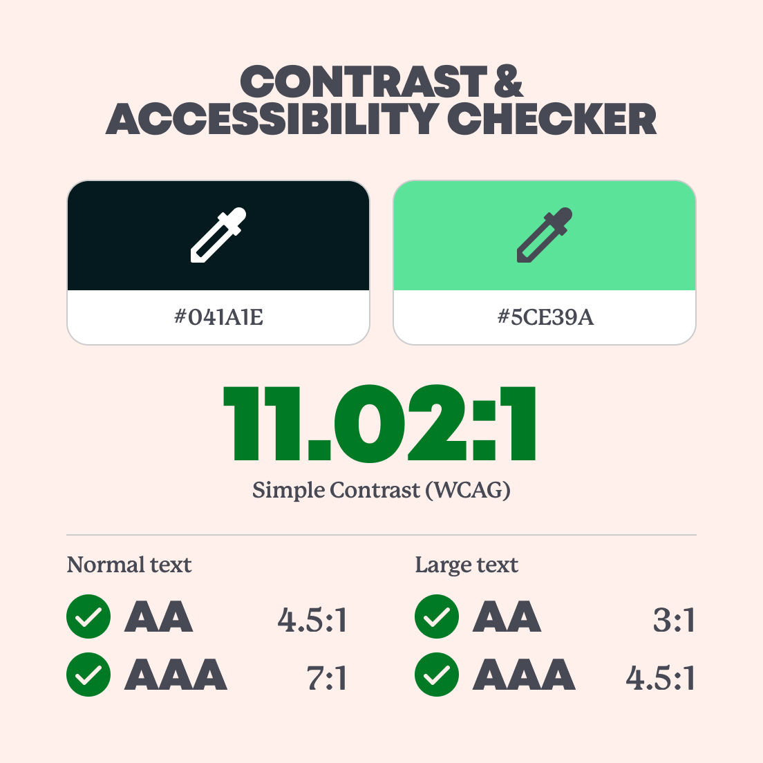
The rule is pretty simple: for normal-sized text, there needs to be a contrast ratio of at least 4.5:1 between the text and its background. Anything falling below this ratio will fail our accessibility checks, but anything meeting or exceeding the ratio passes.
In this post, we’re checking out some of our favourite fictional UIs from TV and film to see how well they’d hold up in the real world, from an accessibility point of view.
Pop culture UIs are everywhere
Interfaces aren’t just on websites or phones. You’ll find them on car dashboards, ATMs, gaming consoles, TVs, and in pretty much every sci-fi or action movie you’ve seen.
Sometimes they’re even interfaces inside interfaces (yes, we see you, Inception). But today we’re looking at the fictional ones, those made for entertainment, not necessarily usability.
So, how do they stack up for accessibility?
Fallout: Pip-Boy
✅ Pass
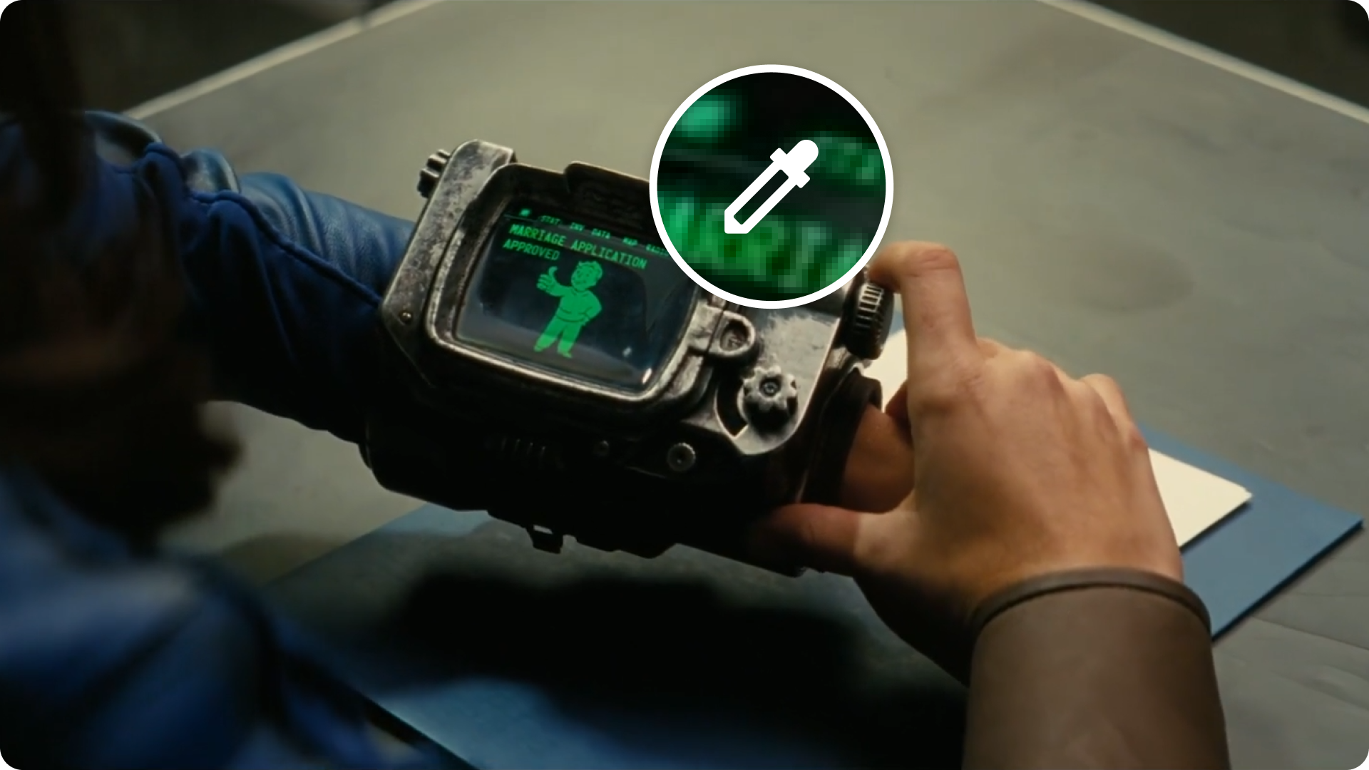
The Pip-Boy, worn by Vault Dwellers in Fallout, tracks radiation, opens vault doors, and delivers notifications. It’s like a post-apocalyptic smartwatch.
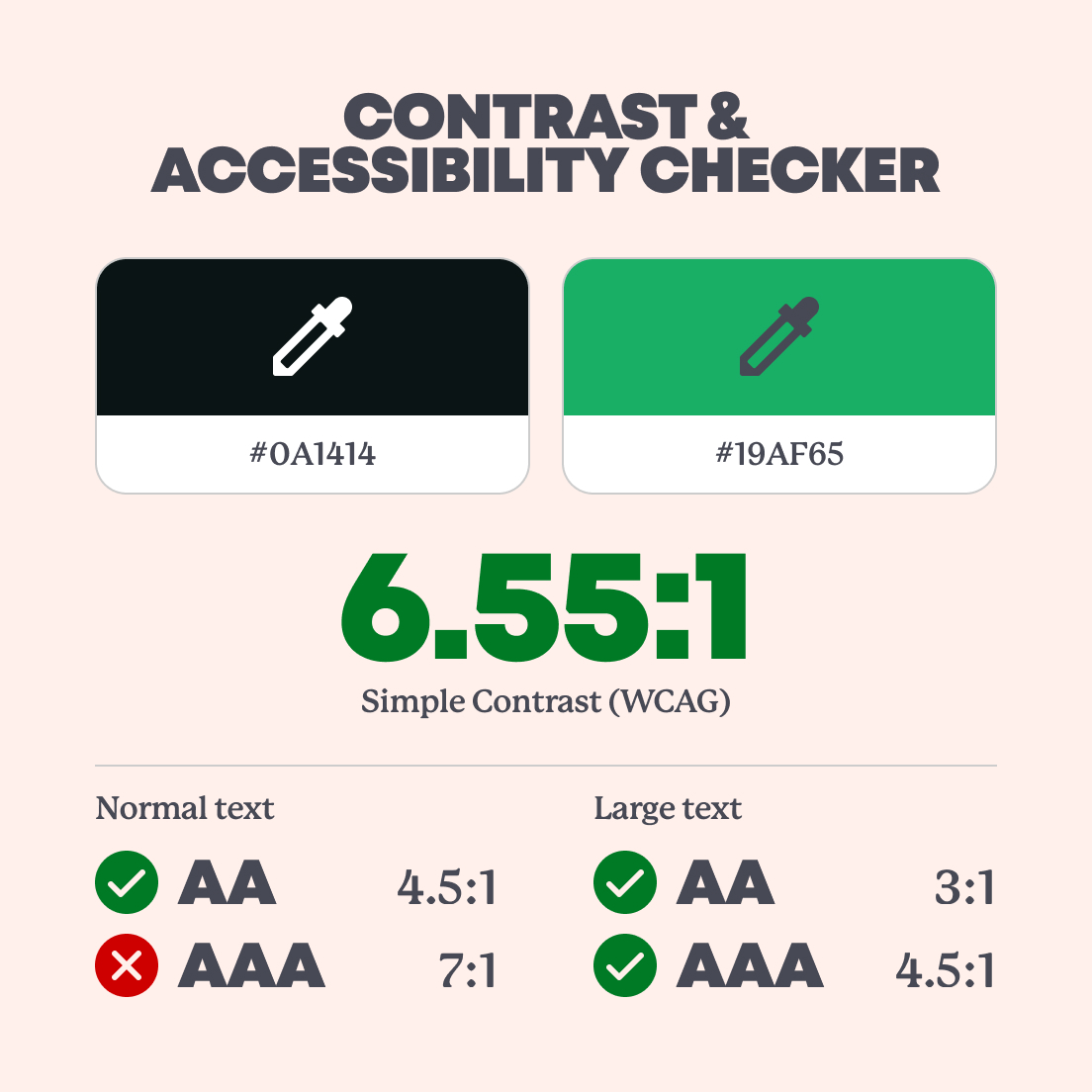
And the good news is that the high-contrast green-on-black screen passes our contrast and accessibility checker with flying colours, making it the perfect accessory in a post-apocalyptic world.
Terminator vision

❌ Fail
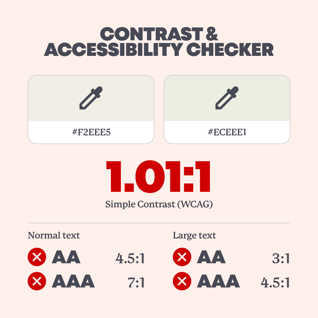
You know the red-tinted view from the T-800’s POV in Terminator 2? It’s iconic, but not so great for readability.
The lighter parts in the T-800’s vision make it hard to distinguish the text from its background, meaning it fails our accessibility checks. Maybe that’s why Arnie wears sunglasses all the time, they help to act as an overlay and bump up the contrast 😎.
Severance: Macrodata Refinement
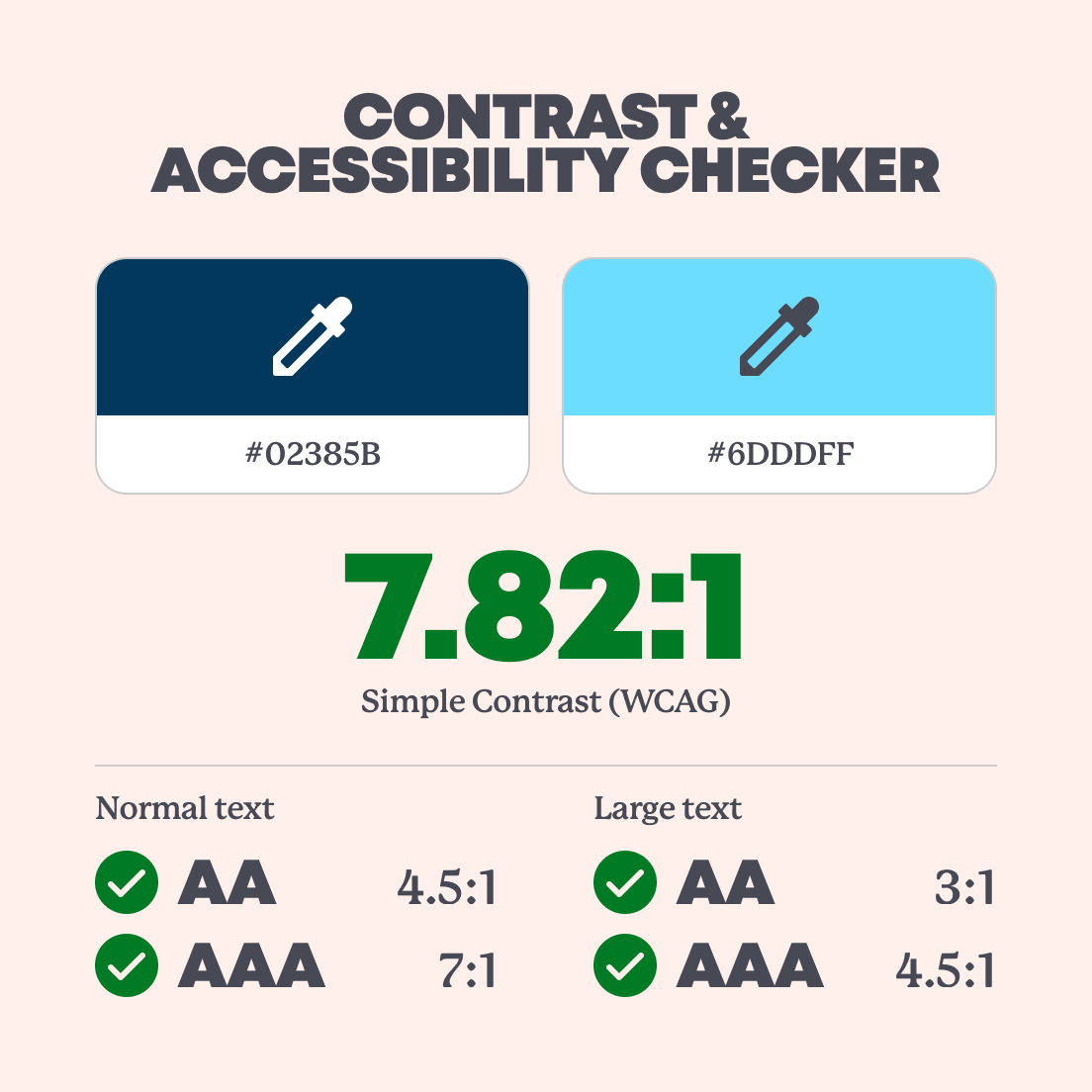
✅ Mostly pass…
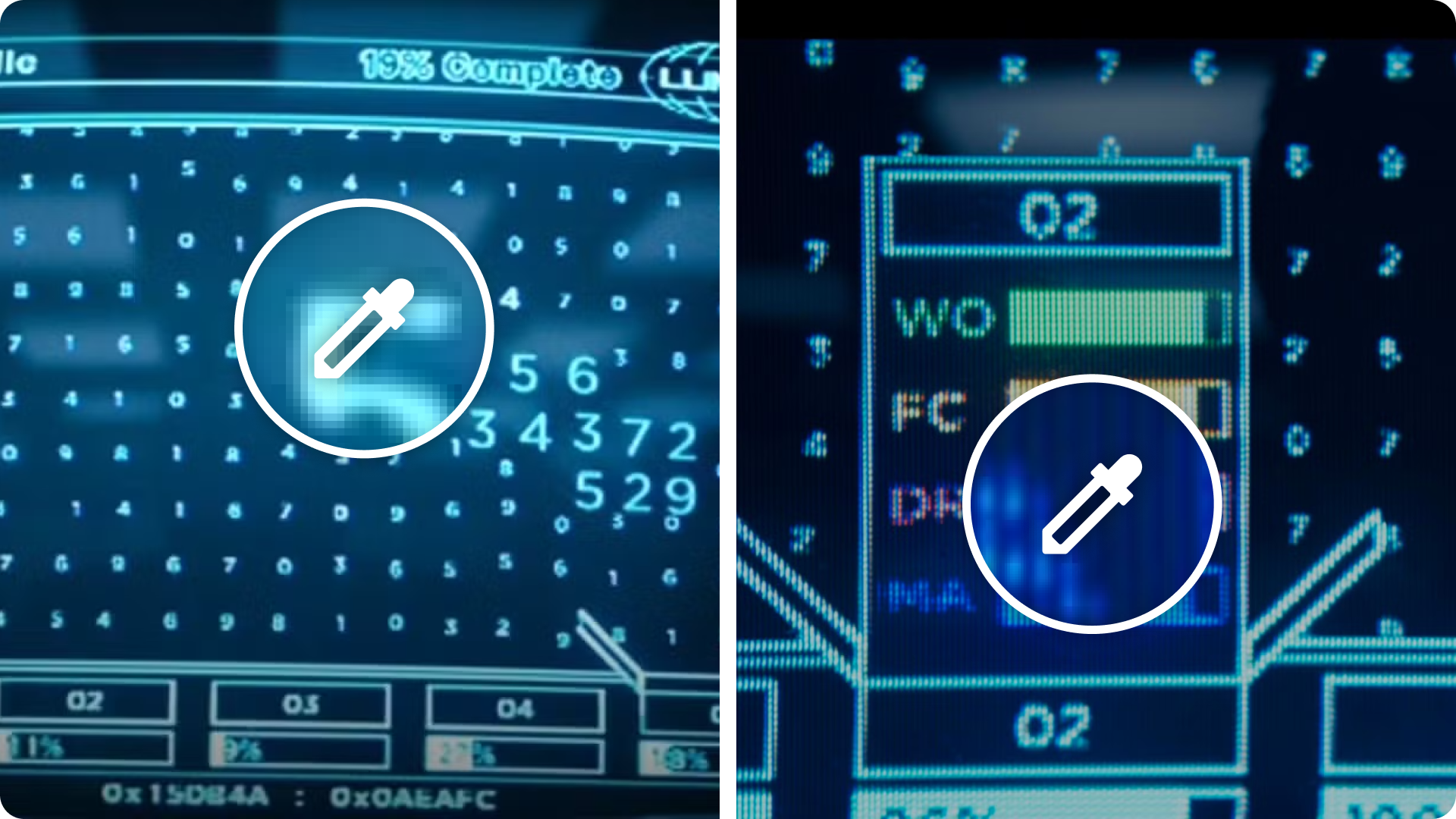
The characters in Severance use a type of computer software to help them with their “refining” on a daily basis. Because this work is mysterious and important, the information they’re seeing must be clear and legible.
The main interface from Severance keeps things simple. A single colour dominates the screen, and it passes contrast checks with no issues.
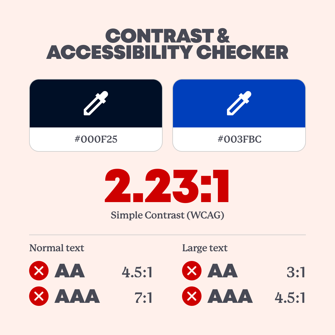
❌ …Partial fail
But… once you look at the secondary colours (like the blue), they don’t meet the required contrast ratio. Mark S. might want to loop in the Accessibility department.
Black Mirror: Nosedive social media
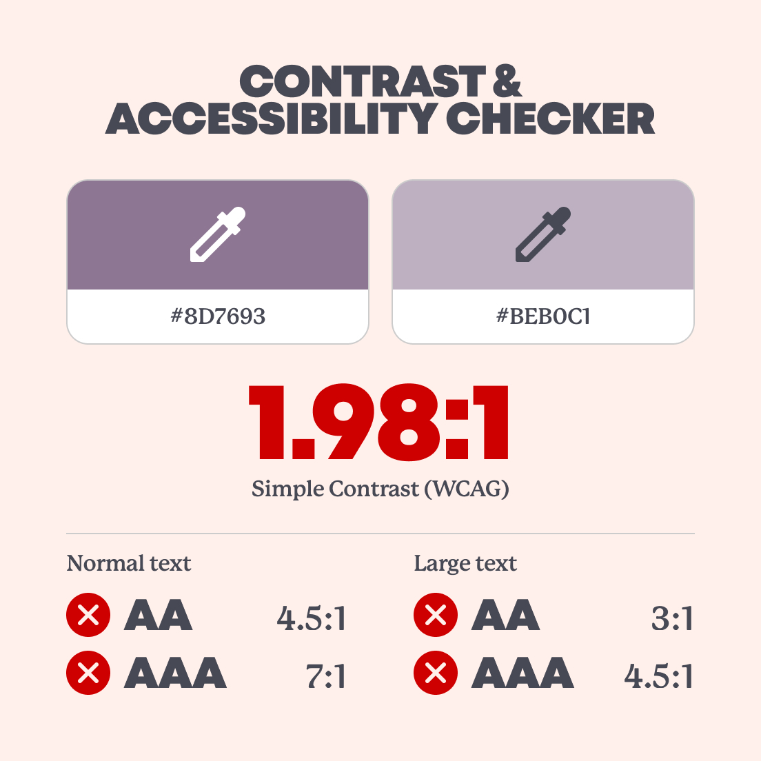
❌ Fail
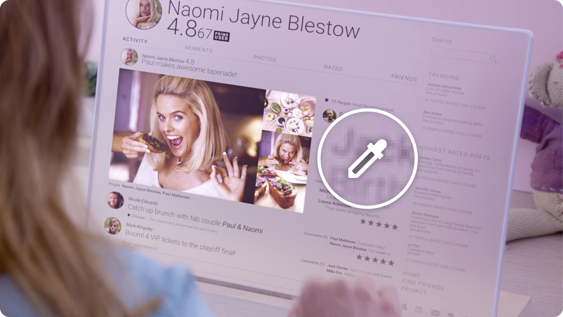
Black Mirror has an abundance of interfaces to choose from, with its many episodes containing futuristic technology. One of these is the social media/rating system-based interface from the episode ‘Nosedive’, which determines the social status of the characters in the show.
Because the interface facilitates every interaction that the characters have with each other in the episode, it's important that it’s easy to use and the characters are able to read from it clearly.
The pastel, Instagram-perfect interface from Nosedive might look nice, but it’s tough to read. Low contrast between the text and background colours makes it one of the worst performers in our checks. Proof that good looks don’t always mean good design.
The Matrix: operator code
💯 Pass with flying colours
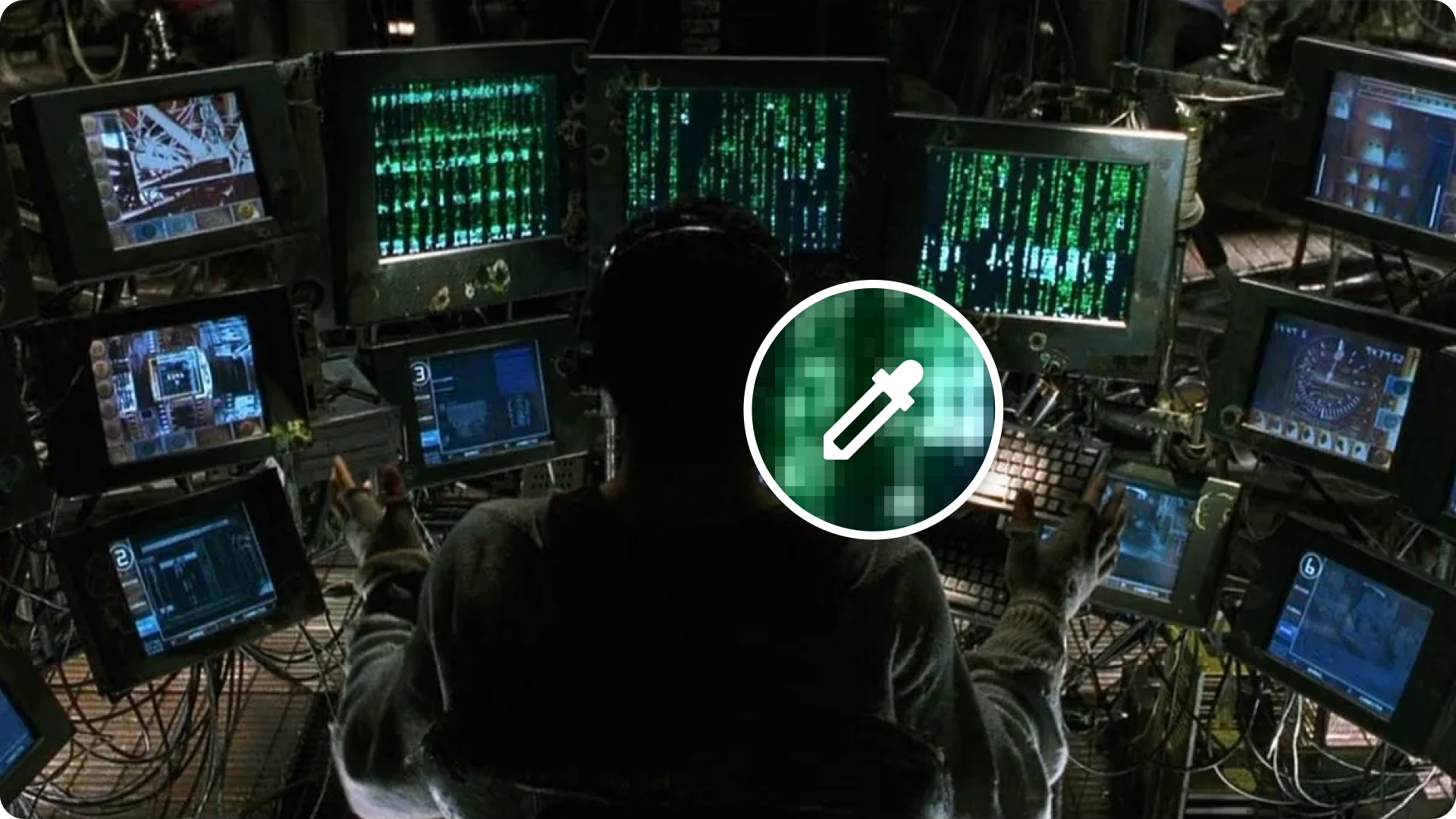
The Matrix is a simulation where the main characters from the film can enter in and out of. Whilst in the simulation, they are often guided by outside ‘operators’ who read code from the simulation to explain what’s happening around them (much like an eye in the sky). The code is represented by green characters raining down a screen, and to most people would be pretty hard to follow and interpret all at once.
The green “code rain” from The Matrix looks intense, but surprisingly, it’s spot on for contrast. Green is one of the easiest colours for the human eye to see, especially on black. Even at bullet speed, the operator interface passes with top marks.
What we learned
Pop culture UIs are made to look cool and futuristic. And while they often succeed in style, they don’t always hold up when it comes to accessibility.
Some designs (like the Pip-Boy and Matrix code get it right), proving that high contrast can still look good. Others, like the T-800’s red display or the pastel tones in Nosedive, fall short.
But whether it’s fiction or real life, accessibility matters. Because if people can’t read or use your interface, the design isn’t really working, no matter how ‘good’ it looks.
Want to make your interface more accessible?
We offer full accessibility audits and UX reviews to help you create inclusive, user-friendly products. Get in touch, we’d love to help you make your design work for everyone.

Ready. Steady. Grow!
We've helped some of the world's biggest brands transform and grow their businesses. And yours could be next.
So if you've got a business challenge to solve or a brief to answer, we'd love to hear from you. Simply complete this form and one of our experts will be in touch!


